CMC Logo & Branding
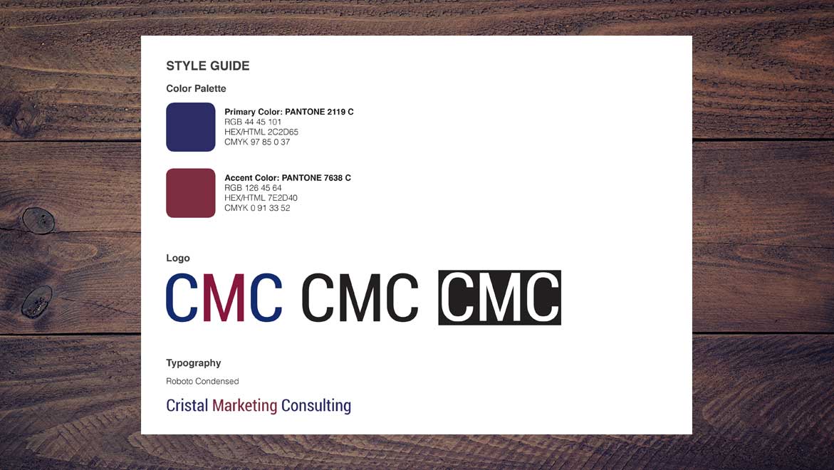
The owner of Cristal Marketing Consulting (CMC) required a new logo and brand identity for her business. While she was primarily targeting the healthcare market, she was open to clients in other industries as well. She wanted to create a "clean and elegant" wordmark for CMC, utilizing deep blue (associated with healthcare) as well as warmer secondary color. She specifically requsted that I avoid green or gold as the secondary color, as these colors commonly appear in other healthcare logos. In addition to the logo and color palette, she also needed to select a typeface for her brand - one that was either available through MS Office or free to download.
I started by researching a variety of typefaces for the CMC wordmark. I proposed six options, including a range of sans-serif, serif, slab-serif, and a display typefaces conveyed a "clean an elegant" look.
For the color palette, I started by selecting a primary/base color. I researched options on the Pantone website, and I came up with Pantone 2119 C, similar to the deep blue in other healthcare logos. Next, I utilized the deep blue as my base color to research color schemes with Adobe Color CC. I tried a variety of traditional color schemes, but they seemed to lead me green and gold - the colors to be avoided. So I went on to customize the color schemes further, and concluded with: taupe, purple, light blue-violet, and deep red as proposed secondary colors.
Finally, I researched typography that was avaible through MS Office or avaiable for free download. I looked for typefaces that were complimentary to the logo style, carrying forward the "clean and elegant" look and feel. The final typefaces I proposed were: Georgia and Trebuchet (available with MS Office), as well as Roboto, Bebas Neue, and Apple Garmond (avaialble to download for free).Project Details
Date:
January 2016
Technologies:
Illustrator CC 2015, InDesign CC 2015
Company:
Cristal Marketing Consulting
Download:
Design Process (PDF)